The colour of the earth. A rich, dark, peat brown, evoking leather, wood and even chocolate. We always find ourselves drawn to this colour; its depth has a graphic quality like black, but with a warmer, more natural feel. We even fantasise about opening a shop where all the products are brown!
 An esoteric choice, this is not really one colour at all, but rather a mélange of blacks, greys and natural tones. We appreciate this colour in many materials: stone, flannel and asphalt, to name but three. It brings to mind the grey felt sculptures of Joseph Beuys, whose work we have long admired.
 Drab in name but not by nature! We like the functional aspects of this organic colour, which makes us think of army kit and outdoor clothing. It is a difficult shade to define, ranging from greeny brown, to browny green. We also enjoy its association with the clays and glazes used by studio potters.
 A colour associated with straw, wood, dried grasses and wicker. It also evokes brown paper and cardboard. Its neutrality makes it a good background for typography. It is entirely at home in the world of craft items, and is a signature colour at LABOUR AND WAIT.
 Crisp white cotton, cool white linen and soft white chalk – they all confirm our passion for this colour. We like its severe, clinical connotations, though softer bleached or faded whites are no less pleasing. After all, what is more satisfying than a fresh sheet of white paper?
 A strangely synthetic shade of blue. Applied to many functional everyday products and frequently found in toolboxes. Rawlplugs, electrical wiring, and screwdriver handles often come in this striking shade. Plastics and other man-made materials give the colour a special vibrancy.
 A bold and cheerful orange. This colour works well in typographical elements and paper products, but also when used for shiny enameled surfaces. A striking highlight, evoking building paraphernalia and warning signs. And for us a Penguin will always be, not black and white, but orange!
 This rich dark blue is a true classic, originating from naval uniforms. It is often contrasted with white or ecru. The classic striped Breton T-Shirt has become a LABOUR AND WAIT favourite. Textiles take this colour particularly well. It is also effective when used for typography, instead of the more obvious black.
 An optimistic colour which heralds the start of spring, promising a wealth of things natural; the yellows of beeswax, mustard seeds and egg yolk. But not for us! Instead, this colour makes us think of rubber gloves, dusters and protective oilskin clothing.
 This shade of green reflects our appreciation of an industrial aesthetic. Whenever we visit factories, we notice this particular colour all around us. It seems that much industrial machinery of the past as painted in this shade of green. This is not a natural colour but rather a mechanical one.
 A true red which demands attention. Historically a colour of passion and power, red also has strong associations with danger. For us, it is a very British colour, redolent of London buses, telephone boxes of old and regimental uniforms. It also lends itself to utilitarian products and tools.
 Deep and dark, black gives objects a sculptural quality, as it defines their shape. We often choose black products for LABOUR AND WAIT; the density of the colour can create a dramatic effect. The bold, graphic combination of black with white always has impact.
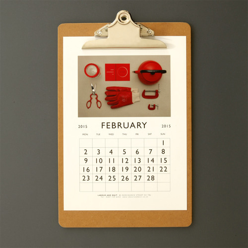
Now that our 2015 Calendar is sold out, we will be sharing each monthly image on our blog throughout the year.
Our calendar this year takes the form of an imaginary chart showing twelve of our favourite colours. We find that we are naturally drawn to certain shades, often those which resonate by reminding us of some particular object. These colours reoccur in many of the products which we select for the shop. We have an aversion to all things ‘pretty’, preferring solid, durable tones. We asked ourselves: ‘What would a LABOUR AND WAIT colour chart look like? What would we name the colours…?’
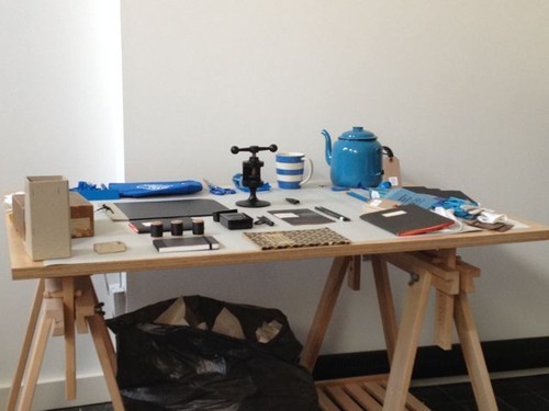
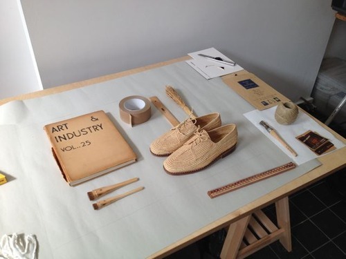
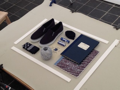
Until then, here are some behind the scenes images taken during our shoot.